Pantone (COTY) Cultural encoding
Neutrality Reconsidered: The Science and Philosophy of White in Contemporary Color Theory (2016–2026)
Pantone’s annual “Color of the Year” program has evolved from a niche forecasting exercise into a globally recognized mechanism of aesthetic standardization and commercial signaling. While often discussed in lifestyle media as a cultural event, the program is more accurately understood as a synthesis of trend analysis, semiotics, consumer psychology, and market coordination.
Over the past several years, Pantone’s selections demonstrate a measurable progression in response to macroeconomic instability, digital behavioral shifts, and evolving consumer sentiment. Rather than functioning purely as aspirational branding, the selections increasingly operate as chromatic indicators of broader emotional and commercial conditions.
The 2021 selection—Ultimate Gray paired with Illuminating yellow—represented an unusually explicit dual-symbol system. Neutral gray encoded durability, infrastructural reliability, and continuity, while the saturated yellow introduced a controlled optimism vector. The pairing emerged during pandemic-era uncertainty, when consumer markets showed elevated demand for stability-oriented products, domestic comfort goods, and psychologically reassuring visual environments. From a design systems perspective, the combination balanced low-arousal neutrality with selective emotional activation.
In 2022, Pantone diverged from historical precedent by introducing Very Peri, a newly constructed color rather than selecting from its preexisting standardized library. This decision is technically significant because it reframed the Color of the Year program from curatorial selection into active color creation. Very Peri occupied a transitional spectral position between blue stability and red-violet stimulation, aligning with increased market emphasis on hybrid digital identity, immersive media environments, gaming aesthetics, and post-pandemic experimentation. The hue’s synthetic quality also reflected the increasing convergence between physical product design and digitally native visual culture.
The 2023 selection, Viva Magenta, marked a return to high-chroma saturation after several years of softened palettes. From a trend-cycle standpoint, this aligns with the historical tendency for periods of prolonged restraint to generate compensatory maximalism. Viva Magenta’s biological reference point—the cochineal dye lineage—simultaneously introduced themes of authenticity and material rootedness while maintaining aggressive visual energy. Across fashion, cosmetic packaging, and experiential branding, the market had begun shifting toward stronger contrast systems, expressive color blocking, and higher emotional intensity. Pantone’s selection codified rather than initiated this movement.
In 2024, Peach Fuzz represented another directional inversion. The hue’s low saturation and high warmth index corresponded with increasing emphasis on tactile comfort, wellness-oriented consumption, and emotionally moderated interiors. Relative to Viva Magenta, Peach Fuzz reduced visual aggression and restored spatial softness. This reflected measurable shifts in residential design trends, hospitality environments, and skincare branding, all of which increasingly favored low-contrast palettes and sensory reassurance over stimulation.
The progression continued in 2025 with Mocha Mousse, a muted brown positioned around themes of grounded luxury, stability, and material familiarity. Technically, the choice reflects the broader re-entry of brown into mainstream commercial palettes after decades of relative avoidance in premium branding contexts. Historically, brown has often been associated with utility, naturalism, or recession-era austerity. However, recent applications in hospitality, fashion, café branding, and “quiet luxury” aesthetics have repositioned desaturated browns as indicators of authenticity and understated consumption. Pantone’s selection recognized the growing commercial viability of earth-based neutrals in a market increasingly fatigued by hyper-synthetic digital color environments. Viewed sequentially, these selections reveal less about isolated trend moments and more about systemic emotional modulation within consumer culture.
Perceptual Color Science and Neutrality
In perceptual color models like CIELAB, white is not a fixed point but a context-dependent reference. It varies based on lighting conditions and observer assumptions.
Key insight: Neutrality is not singular—it exists as a range of near-neutral values. ‘White’, however, serves as the anchor for all neutral color perception. With it’s status as baseline in digital imaging and AI application, white is a defining calibration tool where neutral tones guide normalization in output and background neutrality creates more accurate models via bolstered iterative strength.
• Warm white (#F5F5F0)
• Neutral white (#FFFFFF)
• Cool white (#F0F4FF)
Try out our interactive color neutral tool here → Even minimal shifts change emotional tone and perceived temperature.
//\\//\\
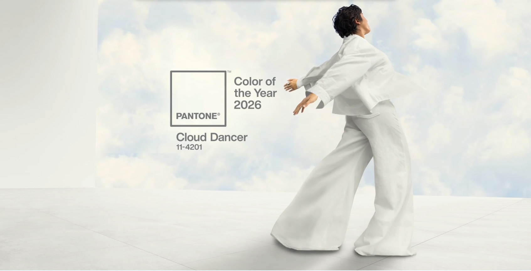
Color theory has historically prioritized hue relationships and contrast. Over the past decade, however, neutral palettes—especially white—have gained prominence across digital design, architecture, and AI-generated imagery. The selection of Pantone 11-4201 “Cloud Dancer” as the 2026 Color of the Year signals a shift in color theory from chromatic emphasis to neutral-centric frameworks. This paper examines neutrality—specifically white—as a perceptual anchor, computational baseline, and philosophical construct. Integrating advances in perceptual color science, machine vision, and historical theory, it argues that neutrality has transitioned from passive absence to an active organizing principle in visual cognition and design systems. Pantone’s selection of Cloud Dancer reflects more than aesthetic preference.
The underlying selection methodology is best understood as a form of cross-sector trend aggregation. The Pantone Color Institute analyzes directional movement across fashion runway data, industrial design, cosmetic development, architecture, entertainment media, digital interfaces, travel patterns, and consumer purchasing behavior. The process resembles forecasting models used in material design and apparel industries, where multi-year trend horizons are constructed through convergence analysis rather than singular prediction.
Importantly, Pantone does not function as an isolated authority imposing arbitrary trends onto passive markets. Its influence emerges through feedback amplification. The company identifies emergent visual patterns already developing across industries, abstracts them into a singular chromatic narrative, and then redistributes that narrative back into the market through coordinated media exposure and licensing partnerships.
This creates a self-reinforcing adoption cycle:
1. Weak signals emerge across multiple industries.
2. Pantone consolidates those signals into a single representative hue.
3. Media coverage increases visibility and perceived legitimacy.
4. Brands incorporate the color into product development and campaigns.
5. Consumer exposure normalizes the palette.
6. The trend gains measurable commercial presence.
The Color of the Year therefore operates less as pure prediction and more as a synchronization mechanism. It reduces aesthetic uncertainty across industries by providing a shared visual reference point around which brands, manufacturers, and designers can coordinate.
From a market perspective, the economic value of the program lies primarily in risk mitigation. Color forecasting helps manufacturers and retailers align production cycles with anticipated consumer sentiment. In sectors such as apparel, cosmetics, interiors, packaging, and consumer electronics, chromatic alignment can materially affect product perception, shelf visibility, and trend relevance.
Criticism of the program often centers on whether Pantone genuinely predicts trends or merely validates them after emergence. Empirically, the latter interpretation is more accurate. Pantone rarely introduces entirely unforeseen chromatic directions. Instead, its selections formalize diffuse market movement into a standardized symbolic framework. The distinction is important as Pantone’s authority is not derived from inventing cultural sentiment, but from compressing complex socio-economic and aesthetic conditions into a singular, commercially actionable color identity.
~a.d.
Active Neutrality
Neutral Axis in Color Space
Interactive Near-White Color Explorer
Adjust subtle hue shifts in near-whites. Notice how small changes affect perception.
Tone: Neutral White